The burndown chart is a crucial tool in project management, especially within the framework of Agile and Scrum methodologies. It provides a visual representation of the work remaining to be completed over a specific period. At its core, the burndown chart plots the amount of work, typically measured in story points or tasks, against time. This simple yet powerful visual aid offers teams and stakeholders a clear understanding of the project's progress at a glance.
The chart starts with a defined amount of work at the beginning of a sprint or project phase. As time progresses, the line on the chart should slope downwards, indicating that work is being completed. If the line remains flat or even slopes upwards, it signals potential issues such as underestimated work, unforeseen obstacles, or inefficiencies within the team. By regularly updating and analyzing the burndown chart, teams can proactively address problems and make informed decisions to keep the project on track.
Moreover, the burndown chart serves as a communication tool. It allows team members, managers, and clients to have a common understanding of the project's status. Everyone can see how the work is progressing, whether the team is on schedule, and if any adjustments need to be made. This transparency fosters trust and collaboration among all parties involved in the project.
How the Burndown Chart Reflects Team Productivity
One of the key ways the burndown chart reflects team work efficiency is through the rate at which the work is being completed. A steep downward slope on the chart indicates that the team is making significant progress and is highly productive. This could be a result of effective planning, clear communication, and a well - coordinated effort among team members. When the team has a good understanding of the tasks at hand, and each member knows their role, they can work together smoothly to complete the work quickly.
Conversely, a shallow slope or a flat line on the burndown chart may suggest low productivity. This could be due to various factors. For example, if the team has not properly estimated the effort required for each task, they may find themselves struggling to make progress. Additionally, communication breakdowns can lead to misunderstandings, rework, and wasted time. If team members are not sharing information effectively or are working on tasks that are not in sync with the overall project goals, it will slow down the progress and be reflected in the burndown chart.
Another aspect of productivity that the burndown chart reveals is the team's ability to handle interruptions and changes. In a real - world project environment, there are often unexpected events such as new requirements or urgent issues that need to be addressed. A resilient and efficient team will be able to adapt to these changes without significantly disrupting the overall progress. The burndown chart can show how the team copes with such disruptions. If the line on the chart fluctuates but still manages to trend downwards over time, it indicates that the team is able to adjust and continue making progress.
Analyzing Team Collaboration through the Burndown Chart
Team collaboration is essential for project success, and the burndown chart can offer insights into how well a team is collaborating. When a team collaborates effectively, tasks are completed in an integrated manner. This means that different parts of the project that are dependent on each other are finished in a timely sequence. On the burndown chart, this is reflected in a smooth and consistent downward trend. Each team member is aware of how their work impacts others, and they coordinate their efforts accordingly.
In contrast, poor collaboration can lead to a jagged or erratic burndown chart. For instance, if one team member is waiting for another to complete a task before they can start their own work, and there is no proper communication or coordination, it can cause delays. These delays will be visible on the chart as plateaus or sudden drops in the progress line. Additionally, if there are conflicts within the team that are not resolved promptly, it can affect the overall morale and motivation, leading to a slowdown in work and an inconsistent burndown pattern.
The burndown chart can also highlight areas where collaboration needs improvement. By looking at the points where the progress stalls or deviates from the expected trend, the team can identify the tasks or stages where there are issues. This allows them to have targeted discussions and implement strategies to enhance collaboration. For example, if a particular set of tasks related to a specific module shows a significant delay, the team can focus on improving communication and cooperation among the members working on that module.
The Role of the Burndown Chart in Identifying Bottlenecks
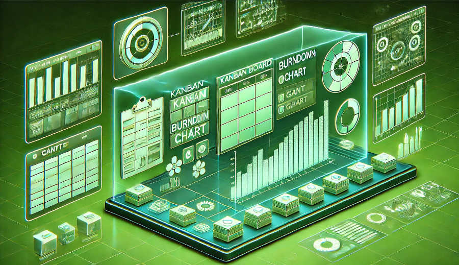
Identifying bottlenecks is crucial for maintaining team work efficiency, and the burndown chart can be a valuable tool in this regard. A bottleneck occurs when a particular task or process slows down the entire project. On the burndown chart, a bottleneck is often visible as a flattening of the line or a significant deviation from the expected progress. This could be due to a variety of reasons, such as a lack of resources, a complex task that requires specialized skills, or dependencies on external factors.
When a bottleneck is identified on the burndown chart, the team can take immediate action to address it. For example, if a lack of resources is the cause, the team can reallocate resources from other areas or request additional support. If the bottleneck is due to a complex task, the team can break it down into smaller, more manageable parts or seek expertise from external sources. By using the burndown chart to detect bottlenecks early, the team can prevent them from causing significant delays to the project.
Moreover, the burndown chart can help in predicting potential bottlenecks. By analyzing the historical data of the chart and the current progress rate, the team can anticipate if a particular task or stage is likely to become a bottleneck in the future. This proactive approach allows the team to plan ahead and take preventive measures. For example, if the chart shows that a certain type of task has consistently caused delays in previous sprints, the team can allocate more time and resources for it in the upcoming sprints.
Using the Burndown Chart for Continuous Improvement
The burndown chart is not just a tool for tracking progress; it is also a valuable asset for continuous improvement within the team. After each sprint or project phase, the team can review the burndown chart to identify areas where they performed well and areas that need improvement. By analyzing the trends and patterns on the chart, the team can learn from their past experiences and make adjustments to their processes and strategies.
For example, if the burndown chart shows that the team consistently underestimated the effort required for a certain type of task, they can refine their estimation techniques. They can also look at how they managed their time and resources during that period and make changes to ensure more accurate planning in the future. Additionally, if the chart reveals that there were frequent interruptions or changes that affected the progress, the team can develop better change management processes.
The burndown chart also promotes a culture of transparency and accountability within the team. Since everyone can see the progress and the issues reflected on the chart, team members are more likely to take ownership of their work and strive to improve. It encourages open discussions about what went well and what went wrong, which is essential for the team's growth and development. By using the burndown chart as a basis for continuous improvement, the team can enhance their work efficiency over time and deliver projects more successfully.
Conclusion
In conclusion, the burndown chart is an invaluable tool for reflecting team work efficiency in a project. It provides a visual and straightforward way to track progress, measure productivity, analyze collaboration, identify bottlenecks, and drive continuous improvement. By regularly updating and analyzing the burndown chart, teams can gain deep insights into their performance and take proactive steps to address any issues.
The transparency offered by the burndown chart fosters better communication and collaboration among team members, managers, and stakeholders. It allows everyone to be on the same page regarding the project's status, which is crucial for its success. Moreover, the ability to identify bottlenecks early and predict potential issues enables the team to plan and allocate resources effectively, reducing the risk of delays and cost overruns.
As projects become more complex and dynamic, the role of the burndown chart in ensuring team work efficiency becomes even more significant. Teams that embrace the use of the burndown chart and use it as a tool for learning and improvement are more likely to achieve their project goals, deliver high - quality products, and build a reputation for reliability and excellence in the market. Therefore, understanding how the burndown chart reflects team work efficiency is essential for any project team aiming for success.
ARTICLE TITLE :How the burndown chart reflects team work efficiency ,AUTHOR :ITpmlib


