Understanding Burn-down Charts
A burn-down chart is a graphical representation that shows the amount of work remaining in a project over time. The vertical axis typically represents the amount of work left, often measured in hours, story points, or tasks, while the horizontal axis represents time, usually in days or weeks. The chart starts with the total amount of work at the beginning of the project and gradually decreases as tasks are completed. The ideal burn-down line, often represented as a straight line from the top left to the bottom right, indicates the perfect scenario where work is completed at a steady pace.
The primary purpose of a burn-down chart is to provide a quick and easy way to assess the project's health. By comparing the actual progress line with the ideal line, project managers can identify whether the project is on track, ahead of schedule, or falling behind. This visual feedback loop is invaluable for making informed decisions and taking corrective actions promptly. For instance, if the actual line is above the ideal line, it indicates that the project is behind schedule, and immediate measures need to be taken to catch up.
Moreover, burn-down charts are not just for project managers; they are beneficial for the entire team. Team members can see their progress and understand how their efforts contribute to the overall project goals. This transparency fosters a sense of ownership and motivates the team to stay on track. Additionally, stakeholders can use the chart to get a clear picture of the project's status without needing a detailed report, making it an effective communication tool.
Benefits of Using Burn-down Charts
One of the significant advantages of burn-down charts is their simplicity. Unlike complex project management software, burn-down charts are easy to create and understand. They require minimal data input and can be quickly updated, making them suitable for projects of all sizes. This simplicity ensures that project managers can focus on managing the project rather than getting bogged down by intricate tools and processes.
Another benefit is the ability to forecast project completion dates accurately. By analyzing the slope of the actual burn-down line, project managers can predict when the project will be finished. This predictive capability is particularly useful for setting realistic deadlines and managing stakeholder expectations. For example, if the burn-down line shows that the project is progressing slower than expected, project managers can communicate this to stakeholders and propose alternative strategies to meet the deadline.
Burn-down charts also facilitate better decision-making. By providing a clear picture of the project's progress, they enable project managers to identify potential risks and issues early on. This proactive approach allows for timely intervention and mitigation of risks, reducing the likelihood of project delays and cost overruns. Furthermore, the chart can highlight areas where resources are underutilized or overburdened, enabling project managers to reallocate resources efficiently.
Implementing Burn-down Charts in Projects
To effectively implement burn-down charts, project managers need to establish a clear and consistent method for measuring work. This typically involves defining the units of measurement, such as hours, story points, or tasks, and ensuring that all team members understand and agree on these metrics. Consistency is key to creating an accurate and meaningful burn-down chart.
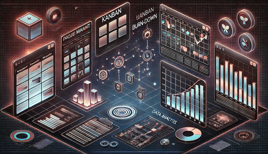
Regular updates are essential for maintaining the accuracy and relevance of the burn-down chart. Depending on the project's duration and complexity, updates can be daily, weekly, or at regular sprint intervals. The frequency of updates should be determined based on the project's needs and the team's capacity to provide timely data. Regular updates ensure that the chart reflects the current state of the project and provides actionable insights.
Collaboration is another critical aspect of implementing burn-down charts. Project managers should involve the team in creating and updating the chart to ensure that it accurately represents their progress. This collaborative approach fosters a sense of accountability and encourages team members to take ownership of their tasks. Additionally, regular team meetings to review the burn-down chart can provide an opportunity to discuss progress, address concerns, and adjust plans as needed.
Conclusion
In conclusion, burn-down charts are a must-have tool for project managers, offering a simple yet powerful way to track and manage project progress. Their ability to provide a clear visual representation of remaining work, forecast completion dates, and facilitate better decision-making makes them invaluable for ensuring project success. By understanding the fundamentals of burn-down charts, recognizing their benefits, and implementing them effectively, project managers can enhance their project management capabilities and deliver projects on time and within budget.
Burn-down charts are not just a tool for tracking progress; they are a catalyst for effective project management. They promote transparency, foster collaboration, and enable proactive risk management. As project environments continue to become more complex and dynamic, the importance of burn-down charts will only grow. Embracing this tool is not just a best practice; it is a necessity for any project manager aiming to excel in their role.
FAQ
1.What is the difference between a burn-down chart and a burn-up chart?
A burn-down chart shows the remaining work over time, while a burn-up chart shows the cumulative completed work over time. Burn-down charts are useful for tracking progress and predicting completion dates, whereas burn-up charts are better for showing the overall progress and scope of the project.
2.Can burn-down charts be used for non-software projects?
Yes, burn-down charts can be used for any type of project, not just software development. As long as there is a way to measure the remaining work, such as hours, tasks, or milestones, burn-down charts can be applied to track and manage progress effectively.
3.How often should a burn-down chart be updated?
The frequency of updates depends on the project's needs and the team's capacity. For short projects or sprints, daily updates may be appropriate. For longer projects, weekly or bi-weekly updates might suffice. The key is to ensure that the chart remains accurate and relevant to the project's current state.
ARTICLE TITLE :Burndown chart: A must-have tool for project managers ,AUTHOR :ITpmlib


